Coloured desk tops, and the fabrics that match them
Give a desk top a colour and you have started a conversation the woodgrains never did. Five finishes, and the seating that sits beside each one.
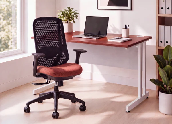
A walnut top asks nothing of the chair beside it. A deep teal one has an opinion. Coloured desk tops have quietly become one of the easiest ways to give a floor character without touching the architecture, and they now come at the same price and the same lead times as the woodgrains we have specified for years.
The five finishes we return to most often are Carbon Grey, Dove Grey, Moss Green, Brick Red and Deep Teal. Each one changes what the seating around it needs to do.
Carbon Grey
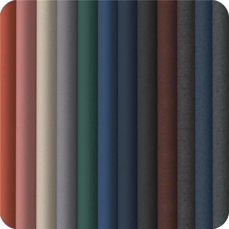
The darkest of the five, near-black without going flat. It anchors a floor and lets the colour happen in the chairs, so it is the top to reach for when the desks themselves are not the place for brightness. A near-black upholstery reads as one deep, considered surface; a mid grey lifts it a step. If you want warmth, a golden yellow lands the moment someone walks in, and a deep rust does the same more quietly.
Dove Grey
The lighter half of the pair, and the one that works hardest where daylight is thin — basements, internal floors, anywhere the windows are more of a rumour than a feature. A clean mid grey keeps it tonal, a warmer brown-grey stops the scheme feeling cold. A light top also gives you room to be bolder, so deep navy or terracotta both hold their own.
Moss Green
The softest of the five, and the one that reads almost residential. That is exactly why it lands in the rooms trying hardest not to feel like an office. Lighter moss sits just above the top for a tonal scheme; a darker olive takes it the other way. Green loves a warm partner across the wheel — a deep berry red for the rich version, terracotta-pink for something softer.
Brick Red
The bold one. A single bank of desks in Brick Red anchors a scheme; a whole floor makes a proper statement. Reds need care when going tonal, so stay close to the top rather than trying to contrast within the same family, and use neutral seating everywhere else on the floor.
Deep Teal
The most confident of the five without tipping into novelty. It works beautifully alongside natural timber, black metalwork and planting, and it gives a reception or a project space an identity that a woodgrain never will.
How we use them
In practice we rarely specify a coloured top across an entire floor. It works best used deliberately:
- One department or neighbourhood, so wayfinding happens without signage
- Meeting and project tables, where the room can take a lift
- Reception and touchdown areas, where first impressions are formed
If you would like to see the finishes and fabric options side by side, we can bring samples to you and lay them out against your existing flooring and light.